In his Econimica blog (https://econimica.blogspot.com/2021/03/the-narrative-of-inflation-amid.html), Chris Hamilton continues to be among the most spot-on analysts in the econophysics. Curiously, he probably doesn’t see himself as an econophysicist.
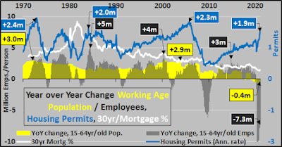
Before jumping to Chris’s recent post, note the year-over-year changes above in key metrics: working age population (increasingly negative), employees (very negative), housing permits (increasingly positive), and 30-yr mortgages (positive and falling).
In a nutshell, at the moment, more houses entering the market even as market participants are declining.
As Chris notes:
Very basically, the major driver of economic growth is the growth of that population of consumers, their income, savings, and access to credit. If that population is growing at 1.5% annually then you can add an additional 1.5%+ growth for maintaining &/or building out greater production, supply chain, housing, infrastructure, etc to support that larger consumer base. This essentially gets us to a 3% growth in GDP.
Let’s jump into the back-end of Chri’s blog but you should read the whole thing: https://econimica.blogspot.com/2021/03/the-narrative-of-inflation-amid.html
So, when I show the year over year change (qtrly basis) of the total population versus GDP since 1960, it should be clear why we need the economy to grow ever less in order to serve us…because there is ever less growth to be served by the economy (below)! 2020 growth was 1/7th that seen in 1960 (yes, on a % basis).

And when I include the year over year change in the working age population (15-64yr/olds…red line below), well, we now have outright declining annual demand from the segment of the population that drives the economy…so flat’ish GDP should about be adequate to take care of flattish demand? But the Fed would call that recession and provide more interest rate cuts, more QE, more acronyms yet to be invented to goose activity to suit the needs of the financial system.

So, the Federal Reserve is targeting 2%+ GDP growth (really, significantly higher) against minimal population growth (minimal rising demand) because the economy is no longer about serving our needs…it is now we and the distorted/manipulated economy that is serving the needs of the federalized financial Ponzi scheme. As the chart below highlights, as the Federal Reserve has pushed rates ever lower, this ever cheaper/greater debt has not served the people or GDP…instead it has rewarded the minority asset holders for being asset holders…simultaneously punished the majority non-asset holders for not holding assets.

It’s usually at this point people start to ask what’s it all about…what is the end game? Since the Fed is privately owned by the largest banks in the world (and they are owned by the 1% of the 1%)…why do these people need more money? I think the simple answer is they don’t need more money. This isn’t about turning their hundreds of millions into billions or billions into tens of billions. I detail the US domestic demographic, economic, financial picture HERE…but no, there seems a different point to all this than making the fabulously wealthy wealthier…suggested HERE.
Summary – The US (and world, at large) is looking at an unexpected and increasingly large decline in births, young, and working age adults. The declining child bearing populations coupled with increasingly negative fertility rates are resulting in an inverted pyramid of continued growth among elderly propagating the collapsing population of young. The result is we appear to be at a tipping point that will result in a realignment of nearly the entire demographic, social, political, economic, and financial systems we’ve come to know and expect. This realignment is likely to be like a magnetic field realignment built around de-growth, managed decline.
Extra Credit for those curious on market valuations…never have investors paid more for less potential growth among consumers (and never, ever have investors paid anything for a declining base of consumers…so FUBAR…but that is where the Fed has led us, so what else you gonna do?). Below, Wilshire 5000 (green line, representing all publicly traded US equities), market value of federal debt (red line, as per Dallas Fed), and year over year change in working age population (yellow line).

