Evil Speculator (https://evilspeculator.com/the-skew-must-flow/) offers some great truths:
- Markets move 87% of price in only 11% of the time, that is both combined to the up side and the down side.
- Within that 87 percentile markets either go UP or push SIDEWAYS 80% to 90% of the time.
- This means rising or range bound markets represent the most common environment that traders will see throughout their trading career.
- Downside corrections only represent ~15% of the 87% during which markets move the most. That leaves us with only about 11% of the time during which markets move significantly to the downside.
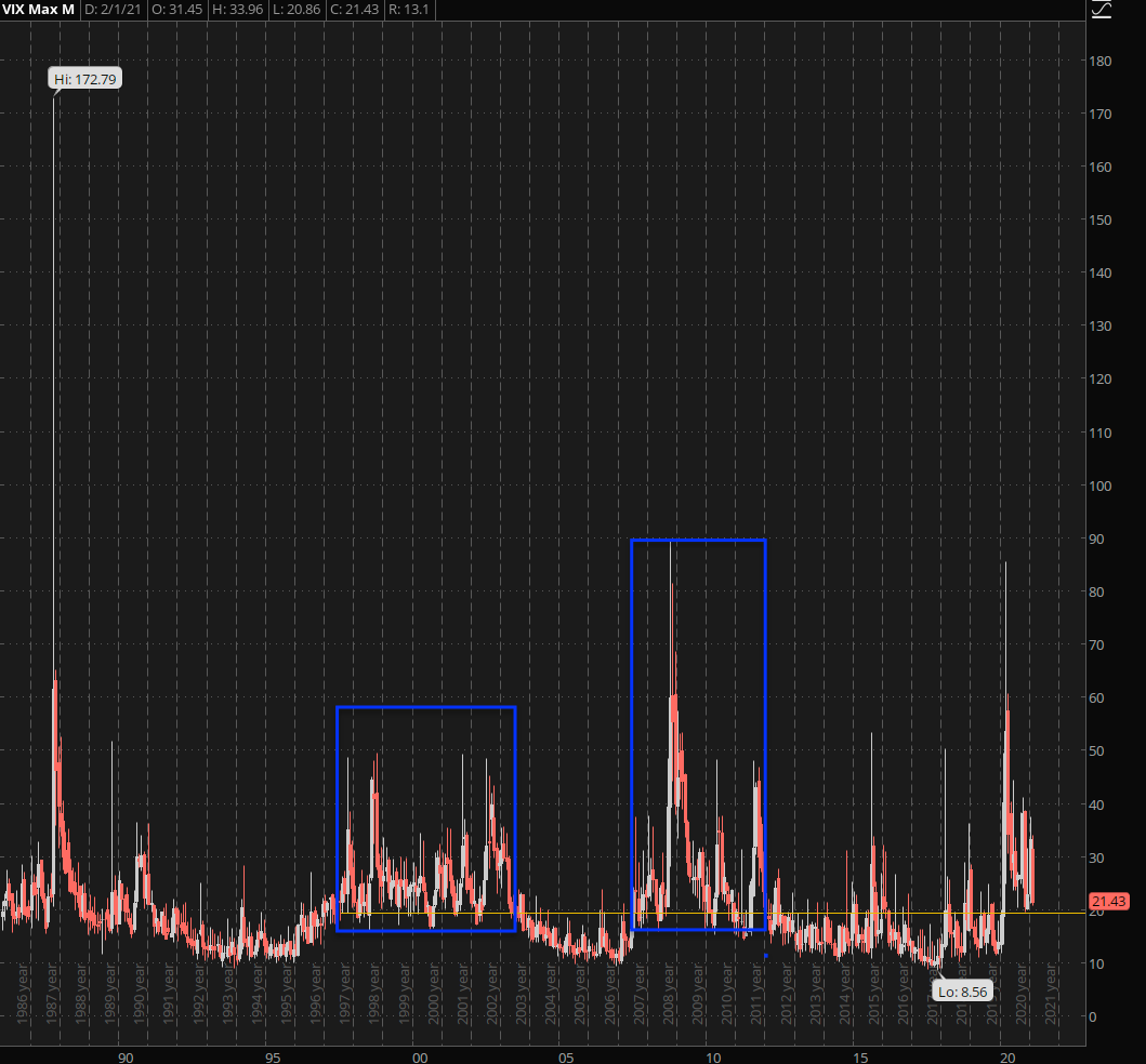
- Volatility spikes usually beget more volatility which is shown by the multi-year plateaus I have highlighted on the chart. That’s however a topic for another day.
- All these stats were present many years before the Federal Reserve jumped the QE shark, cut interest rates to zero, and pulled every conceivable trick in its considerable arsenal to bias the market to the upside.
The long term chart of the VIX I posted above makes the boring stats above abundantly clear. Although we are all idiots and our eyes are immediately drawn to the outliers you can see that the VIX spends most of its time churning in a relatively contained sideways range.