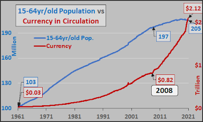
Chris Hamilton of Econimica shared two graphs reproduced above that summarize all we need to know about macro trends (see https://econimica.blogspot.com/2021/04/ever-fewer-people-need-ever-more.html).
You don’t need the usual “talking head” on Squawk Box, or “insights” from some economist to explain the role of “economic slack”.
It’s simple physics: wage-generating population (and, households), and money stock. All there is.
- The top graph plots the “wage earning” US population (15-64 yrs) in blue which appears to have peaked within the last year or two, and is now in decline.
- Meanwhile, note the M2 in red (USD in circulation) going ballistic and reaching escape velocity.
Not clear enough?
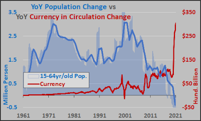
OK, then consider the second graph reporting YoY changes in population and money supply.
Simply put – declining wage earning population (leg down) with accelerating if not spiking money supply (leg up).
Get it now?
And guess what happens next?
